Preview:
Summary:
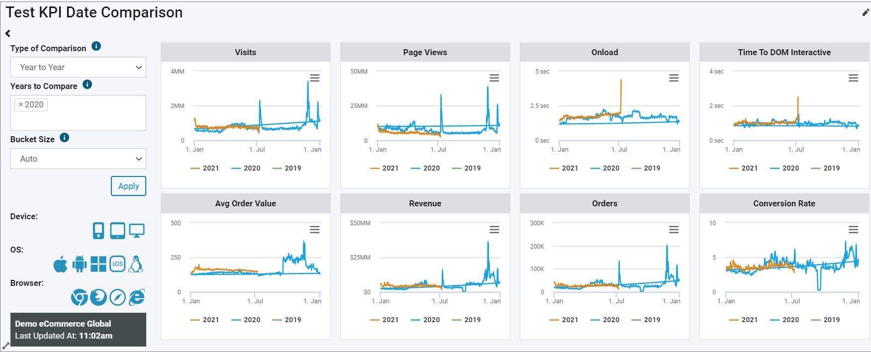
The KPI Date Comparison widget allows you to get a real time comparison of your key performance indicators from a baseline in the past. It's one our most functional dashboard widgets and allows you to customize the exact date or time period for the comparison you want.
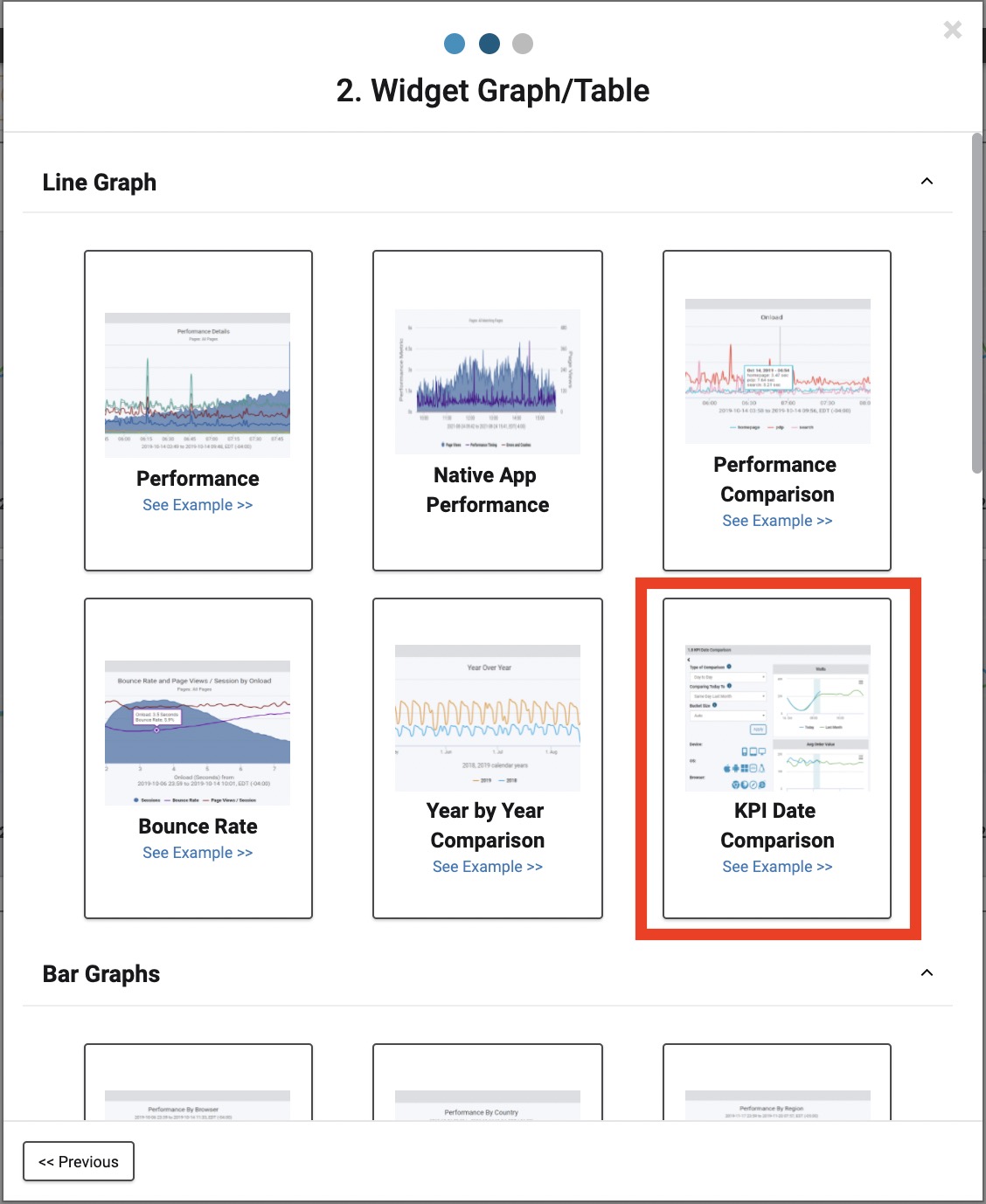
Locating the KPI Date Comparison Widget
The KPI Date Comparison Widget can be found under the 'Real User' category when creating a new dashboard widget.
Configuration and Types of Comparisons
The first thing you'll want to do is set your filters. Once those are set, the next and most important part is choosing the Type of Comparison. There are 3 different types of comparison with this widget, but depending on which is selected, there will be more options to specify the details. Here's a breakdown of the options and sub-options:
-
Year to Year
- Years to Compare
-
Day to Day
- Same Day Last Month
- Same Day Last Year
- Custom Selector
- Past X Days/Weeks
-
Custom
- Comparing YYYY-MM-DD to YYYY-MM-DD
The Year to Year comparison gives you a graph of the full year for each of the selected years. Also, your a line for the current year-to-date.
With the Day to Day comparison you can choose between comparing today to the same day last month, same day last year, or a custom selector such as the average for the past 3 days or the average for the past 8 weeks.
The Custom option allows you to choose two entirely custom dates. This is helpful, for example, when holidays do not align on the same day of the year. This way you can choose today (labor day) and the date of labor day last year.
Once you have your comparison configured, create or update the widget and let's dive into what you'll see when it loads in the page.
About the KPI Date Comparison Widget
For each type of comparison, the widget will have a card with the following metrics in a graph over time:
- Visits (Sessions)
- Page Views
- Onload
- Time to DOM Interactive
- Avg Order Value
- Revenue
- Orders
- Conversion Rate
Inside each graph you can hover your mouse over the lines to get a tool tip reading for the nearest two comparison data points.
For comparisons with today's data, you'll notice a shaded region in the graphs. This denotes ongoing data processing, meaning the numbers are not set in stone yet due to a variety of factors. One of these is the way sessions are determined. At the latest point in time, we do not know if a session has ended until 30 minutes have gone by without another page view. This is one example.
In addition to the shaded region, for graphs that show totals (visits, page views, revenue and orders) the rightmost data point for the "today" line will show a normalized line, i.e. not all of the data for the current hour has come in, so given the amount of time that has passed in the hour and the current amount, this is the projected number for the hour. If you're using a fixed bucket size (less than an hour) for the "today" line, you'll need to normalize those buckets to meet a comparable height as the line of hourly buckets.
Inside the widget to the left you'll find the details of your comparison. You can update the comparison using this area without having to click the edit button for the entire widget. However, clicking the edit button allows you to see all of the filtering and make any necessary filter changes.
Additionally, to the left you can update the Bucket Size. The bucket size controls the granularity of the graphs. Here you can choose whether you get data points in the graphs hourly, every 30 mins, 15 mins, 10 mins, 5 mins or 1 min.
Lasty, to optimize the screen real estate, click the carrot arrow in the top left of the widget to hide/show the left panel.