Preview:

Summary:
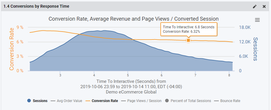
The Conversions by Response Time widget shows you in real-time our favorite graph - the conversion rate curve. This graph shows conversion rate as it relates to traffic volume and page response time on your site.
Details:
The Conversions by Response Time Widget gives you real-time insight into the behavior of your customers as they navigate your site and receive a variety of page speed experiences. The x-axis is page speed (customizable metric) and the y-axis is conversion rate. This graph will abide by the time period selector on the dashboard.
The typical shape of this curve indicates conversion rate increases as page speed decreases. And vice versa - the slower the page loads, the lower the conversion rate.
The shaded region is a histogram of sessions where each 0.1 second cohort represents the number of visitors who received the page at x seconds.
In addition to conversion rate and visitors (sessions), this graph also shows average order value, page views/session, and percentage of total sessions. These additional details are not displayed by default, but you can enable them by clicking the legend icons. Toggle the legend items to hide or show them in the graph.
Configuration
When configuring this widget, there are a few things to be aware of outside of the standard filter set -
Granularity: This is the degree of detail shown in the graph. This setting controls the detail of the x axis, for example, whether the data point goes from 1 to 2 seconds, 1 to 1.5 seconds or 1 to 1.1 seconds.
Discard Sessions Over: This gives you the ability to filter data outside of the 90th percentile, for example. This is very helpful for tuning the report to give you the best representation of your user behavior while filtering out the noise and outliers.
Performance Metric: You can customize which metric is used on the x-axis. Available metrics are:
- Onload
- Time to DOM Interactive
- Time to DOM Content Loaded
- Time to Interactive