Preview:
Details:
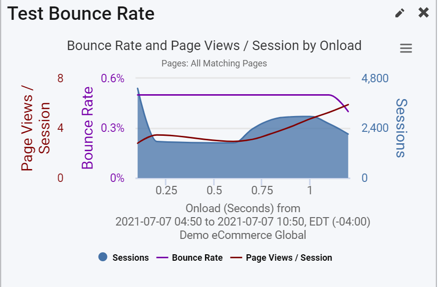
The Bounce Rate widget gives you real-time insight into the relationship between user behavior (bounce rate, page views/session) and performance on your site. The x-axis is page load time and the y-axis is bounce rate. This graph will abide by the time period selector on the dashboard.
What you can expect from the shape of this curve is typically that bounce rate increases as page speed increases. And vice versa - the quicker the page loads, the lower the bounce rate.
The shaded region in the graph is a histogram of sessions where each 0.1 second cohort represents the number of visitors who received the page at x seconds.
In addition to bounce rate and sessions, this graph also shows average page views/session. You can toggle these lines on and off in the graph by clicking them in the legend.
Note you can configure the Granularity in the widget configuration under the Granularity selector. This is the degree of detail shown in the graph. This setting controls the detail of the x-axis, for example, whether the data point goes from 1 to 2 seconds, 1 to 1.5 seconds or 1 to 1.1 seconds.