Preview:

Details:
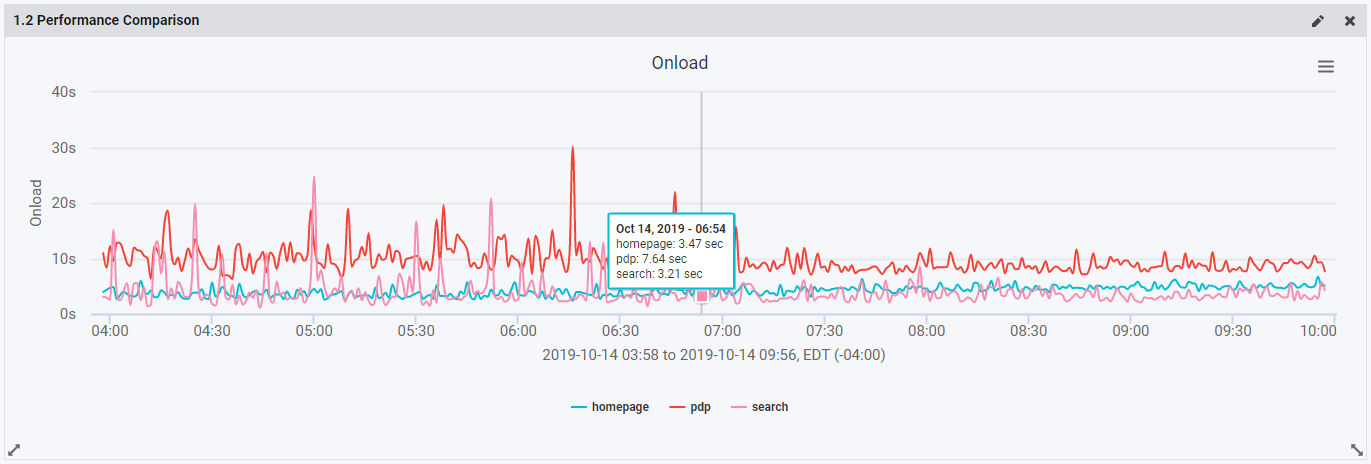
The Performance Comparison widget is the same graph used on both the RUM and Synthetic Page Performance Comparison pages. You can choose RUM or Synthetic data for this dashboard widget. The widget is a line graph over time, with each line representing a page for performance comparison.
You can select the pages in the widget configuration under the Page Name filter. Or, leave it blank to see a single line for All Pages.
Inside the configuration you can also configure the performance metric used to compare, using the Performance Metric selector. This will customize your widget's y-axis, while the x-axis is time.
Like all of our graphs in Blue Triangle, you can click the legend items to hide or show the lines in the graph.